Let me share with you something I found a couple of months ago.
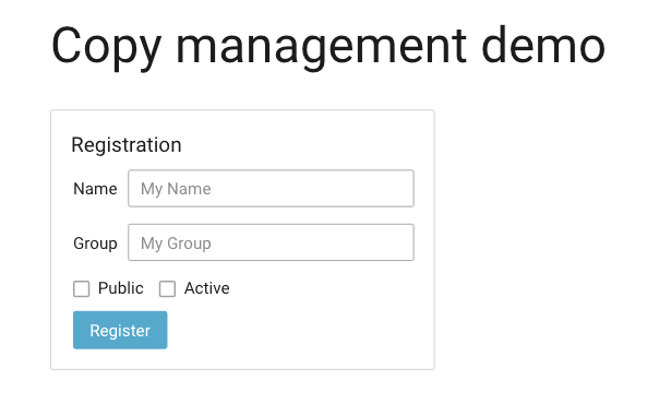
Managing labels and copywriting from the designs to the code is not an easy thing. In particular, if you have many collaborators: product managers, UX designers, UX/copywriters, and developers.
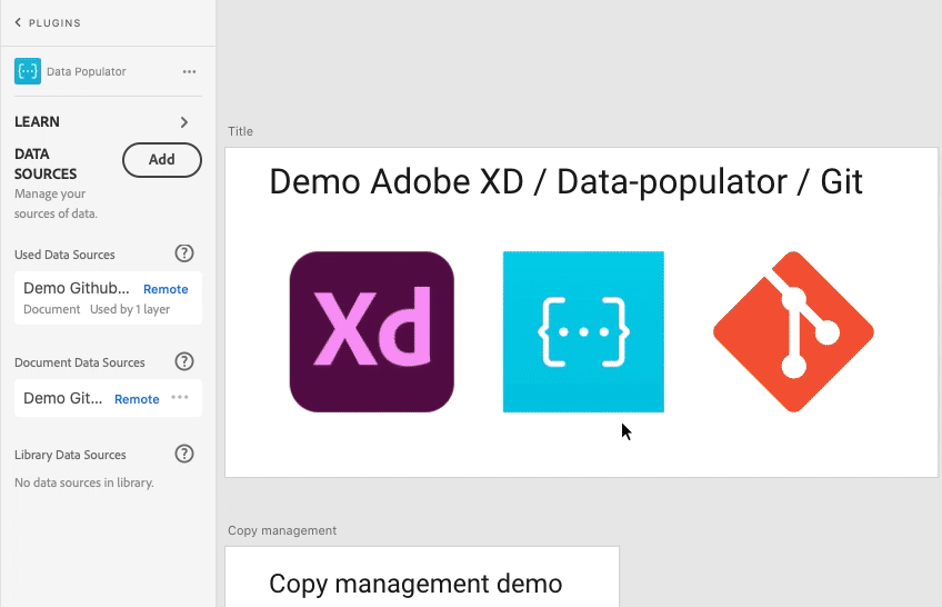
Here is a small demo of how you can link all of that together.
Adobe XD hosts your mock-up design
Git (in my example GitHub) host your code and your labels
The plugin Data Populator does the bridge
Of course, you can use this plugin for much more than that use case.
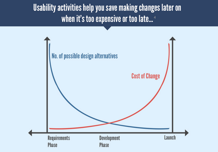
Summary: In that story, I expose how the Shift Left approach from the quality assurance (QA) can be applied to the user experience (UX) processes to increase efficiency.
The shift left is a concept coming from the test strategy and the QA.
It is strongly linked to the concept of the test pyramid.
When I was managing QA engineers we initiated a challenging project to transform our test strategy. At the time our release cycle was pretty long and one main reason was the volume of manual tests. Our QA was spending most of their time running the same test scenarii over and over.
Doing tests earlier in the life cycle allows us to fix issues at a lower cost. Earlier automated tests (unit tests) are cheaper to maintain than end2end UI automated tests. The test pyramid recommends to have a base with more unit tests than the higher layers.
There is a lot of reading about QA, shift left and testing pyramid. Regarding UX and shift left less so… I just found one article by Caitlin Geier about this, while writing that story and it focuses on accessibility design. From that, her company has a page about the Shift Left Accessibility Testing.
My view is that the QA added value is on defining the test strategy, defining the test plan, not running the test. Of course tests still need to be run, but without a proper test plan their value is limited.
The result of our transformation project: our releasing time was reduced from 11 weeks to 5 weeks!!! Independently to open the path to CI/CD (this deserves it owns story), you can guess its value in terms of return on investment (ROI) and work added value.
Now that I am managing UX specialists, I see a strong analogy with UX and QA. Shift left mindset is also very relevant for the UX processes and it is totally in line with Design Thinking and the double diamond.
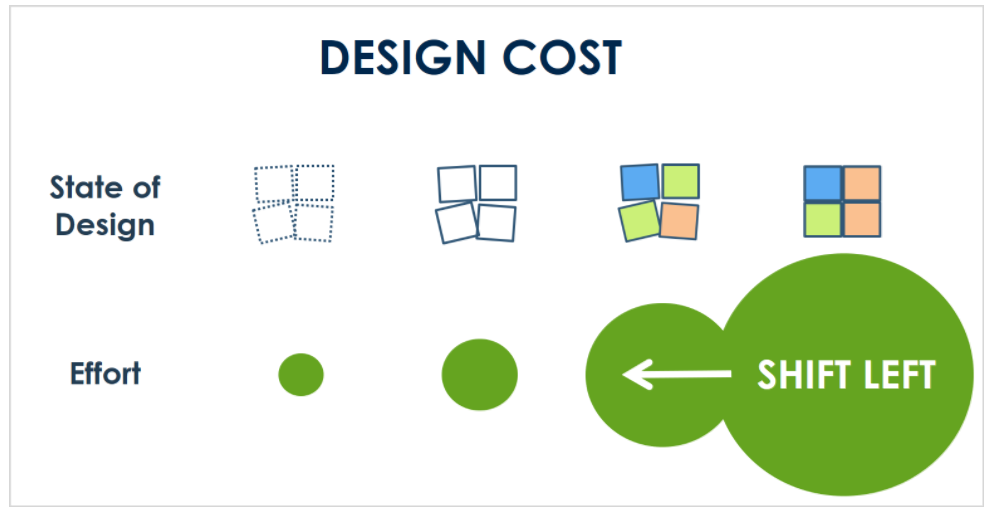
In fact, each level of precision allows the stakeholders to focus on a specific kind of review.
At the beginning of a project we do not want feedback on the color of a panel but on the structure of the information. And doing mock-ups that look high-fidelity (even if they are not) does not help collecting relevant feedback.
Moreover, even before designing zoning and wireframe, we need to have the proper UX strategy and vision and to do that we need to know our users, who they are, what they want and what they do. Without that, our mock-up might be less valuable as we are based on assumptions instead of facts.
Finally, everything is about value and efficiency, in other words: ROI, Frank Spillers’ article on the ROI of UX raises similar arguments than the shift-left approach. In particular, the earlier it is in the process, the higher ROI we get.
Shift left from high fidelity to a lower fidelity design proposal to collect feedback on the correct level of information and be more efficient (as the test pyramid for QA).
Shift left from design to research to properly know the users and have a valuable UX strategy (as the test strategy and the test plan for QA).
I live in Antibes (France), and Univalom is the local organization that manages our waste. For several years now, it has had a program of “zero waste” to help citizens reduce their footprint. I have been part of that program as soon as it was available in Antibes.
During its last edition, with the lockdown, they decided to digitalize the waste tracking.
We have a web application where we can input our waste entries.
That part works great! We are also able to view our data in graphics.
Here are my profile and data:
For me, globally, these diagrams do not work. There is a strong assumption on users that is not valid in my situation. These graphics do not provide me with the proper level of information.
So, I have proposed to Univalom another representation of the data.
But before I share my suggestion:
Do you see the issues?
What is the underlying assumption?
Do you have a solution?
Please, feel free to comment and share your insights.
Our job and skills shape the way we see the world. As an IT guy, I am sensitive to the design of applications. This is a story about my personal experience on a French e-commerce website
Quick version
I found 4 issues:
Confusing UI making the user not trust the rest of the flow
Bad bug (Error 500) stopping the check-out experience
A UX quirk that generates a security issue
A discrepancy in customer experience between the vendor and the delivery service
A conclusion is that UX improvements are not always good and beneficial. Even though most of the time it is :-).
Detailed story
Context: I received an e-voucher to use on an e-commerce website I do not have an account for.
I browse articles, find what I want and fill my basket. A normal online shopping experience. Time to check out, as I am not logged in I am offered to authenticate.
Little did I know what I will have to do just to get my articles…
First issue
I do not have an account. To be fast I want to use my PayPal account. But then it really looks like a payment flow, and as I want to use my e-voucher I am afraid to finalize.
There is a small note on PayPal saying that we can verify our purchase before finalization but that is unclear to me. So, this is the first confusion!
Second issue
Back on the authentication page:
I do not have an account, and there is a check-out flow especially for that. Perfect, let’s go.
Not surprising, I am in a basic user creation flow: title, last name, first name, address, phone, email, password… I am filling out everything!! Then comes the payment page:
I select the gift card option, then I confirm to pay
Error 500. I tried it twice, entering everything to check that it was not on my side.
This is the second issue.
Note: this error has been fixed now. I retried it during the redaction of that article.
In my scenario, we are at the intersection of two use cases: gift card payment and user-creation at check-out. So it is easily understandable that this was not properly tested by the QA (or voluntarily omitted). It does raise questions on their componentization and architecture though…
Third issue
So, now I do not have any other choice to do a basic identification, then later, a check-out.
I am trying to log in with my email (assuming that the previous error did not prevent my user creation). See how the login page behaves (animated GIF below):
The login page detects that I do not have an account and moved my entry to the other input.
Many comments:
So, behind the previous error, the system has not created my account.
As a UX manager, I was thinking, “hum, from a UX and business point of view that seems pretty nice”
However, as a former IT security student, this is a real issue from a security aspect.
That is the third issue I found. If you would like more details on why it is an issue (see below after the lesson learned).
Fourth issue
Understanding the sources of the problems, I create my account following the basic user creation flow. Then I log in and do the check-out and payment without any issue.
I am not sure that all users would persist as I have, but for me, it was to purchase a gift for my wife! So you can understand :-).
Of course, I have reported these issues by opening an incident to their IT support As working in IT, I know the value of these kinds of constructive feedback.
Now I just have to wait for the delivery…
Customer experience is not limited to the website. I have to say that the emailing system to track the order is well done. I am informed of each step. We have emails from the e-commerce website and the delivery service: Chronopost.
However, by overdoing it, the vendor has introduced a confusing discrepancy with the delivery service message.
From the vendor: “Your package has arrived in the pick-up place you have selected”.
From the delivery service: “Your package has arrived in a different pick-up place”.
This is the fourth issue.
It is great to see the integration of the delivery system with the vendor. However, the latter did not inform me about the change of pick-up place. Worse, it confirms the original choice, which generates confusion. I do not know if the use-case of change of pick-up place was not covered or if it is a bug and that could have been on the delivery service side or the API integration by the vendor.
For me, this means that instead of just going across the street to pick up my package I need to take the car as Chronopost does not offer a way to retrieve my package back to its original destination.
Lesson learned
Sometimes the user experience is not improved to avoid the management of complex use cases (and its associated cost) as Chronopost just telling me the change of destination and not proposing alternatives.
Sometimes user experience is not (should not be) improved for security reasons.
However, globally UX improvement is very beneficial and in that story, we still have two opportunities with the PayPal check-out flow and the alignment between the vendor and delivery service emails.
How about you, have you already experienced how your professional knowledge changes how you see things in your day-to-day life?
Let me elaborate on that security aspect
The person behind the screen (or a bot) can easily test if an email address has an account on that e-commerce site.
One basic rule of authentication is to consider the login and the password as a whole. In case of the wrong credentials, a system must reject without specifying which is wrong. In fact, that website does that properly:
However, considering that UX quirk, we can have this message only in case of a wrong password, because if the email is incorrect that it is pushed to another input.
Call me distrustful, but a malicious person/organization can misuse that feature to test a list of French email addresses and know if their owners have an account on that website. One might be familiar with phishing emails pretending to be big players like Amazon, PayPal, Apple… However, phishing emails pretending to be a smaller website where we know the target has an account will be even more convincing.
Maybe there are easier ways for a malicious entity to hack, I might be just stretching and overthinking.